Shoshin Dermatologie

Brand Identity • Logo Design • Corporate Guidelines

A complete brand identity developed for Shoshin Dermatologie, creating a distinctive and consistent visual language across print and digital applications. The project included logo development, typography, color palette, brand guidelines, stationery and corporate applications.

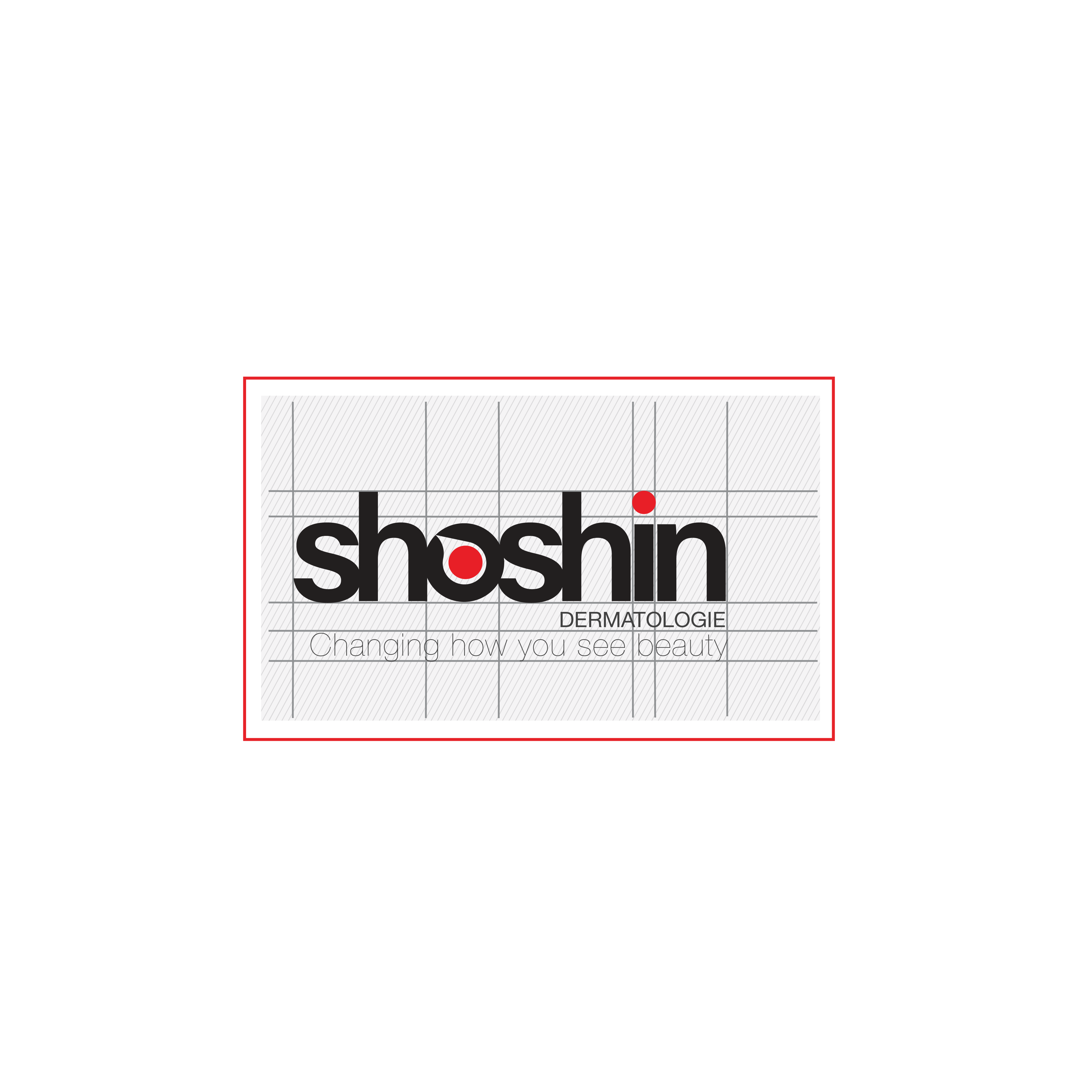
The Concept

The brand concept is inspired by “Shoshin,” meaning “beginner’s mind” — an attitude of openness, curiosity and seeing things without preconceptions. The visual identity was developed around this idea, supporting the brand message: “Changing how you see beauty.”